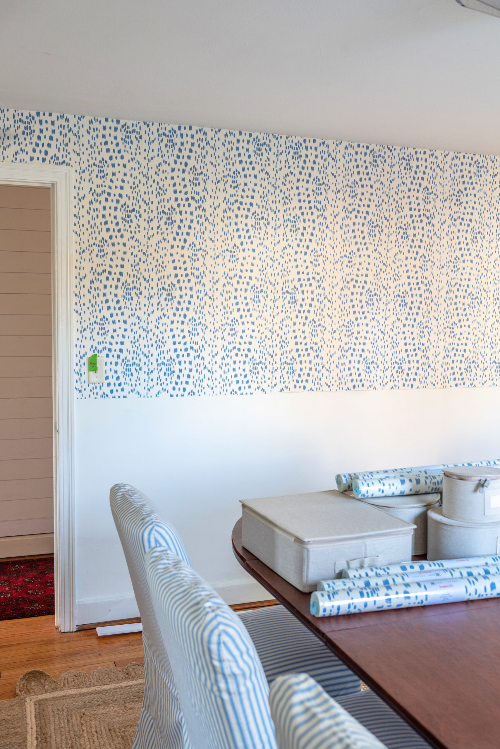
We started our dining room this past weekend and here is a little progress on the space that we made. Last week, I introduced this home project and you can see the design board and introductory details HERE.

The Before

Wallpaper
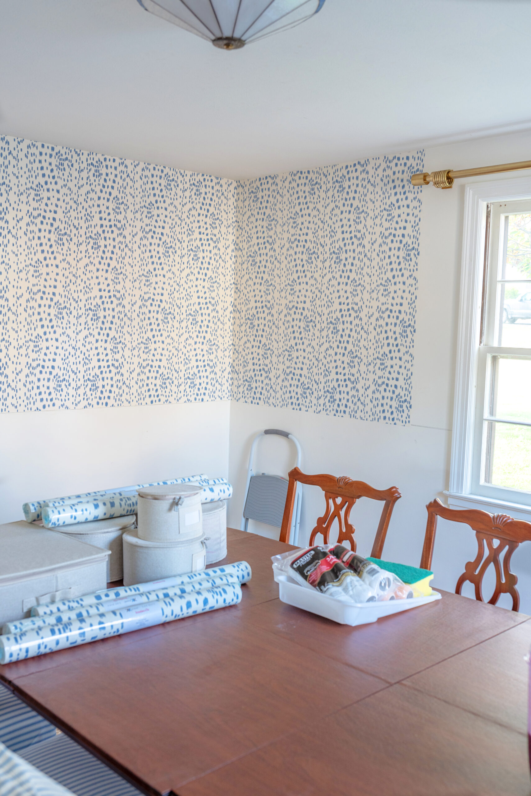
We started hanging the wallpaper and are almost done with the installation. Just one wall left to cover. We are doing half of the walls in one of my all-time favorite papers, Brunschwig & Fils Les Touches in Cadet. I am partnering with Decorator’s Best on this portion of the design. They are such a great resource for designer wall coverings, textiles, trims and more. If you aren’t enlisting the help of a designer or do not have a trade account, this is a great place to shop your favorite design houses. If you do have a trade account, they offer a trade program you can join.
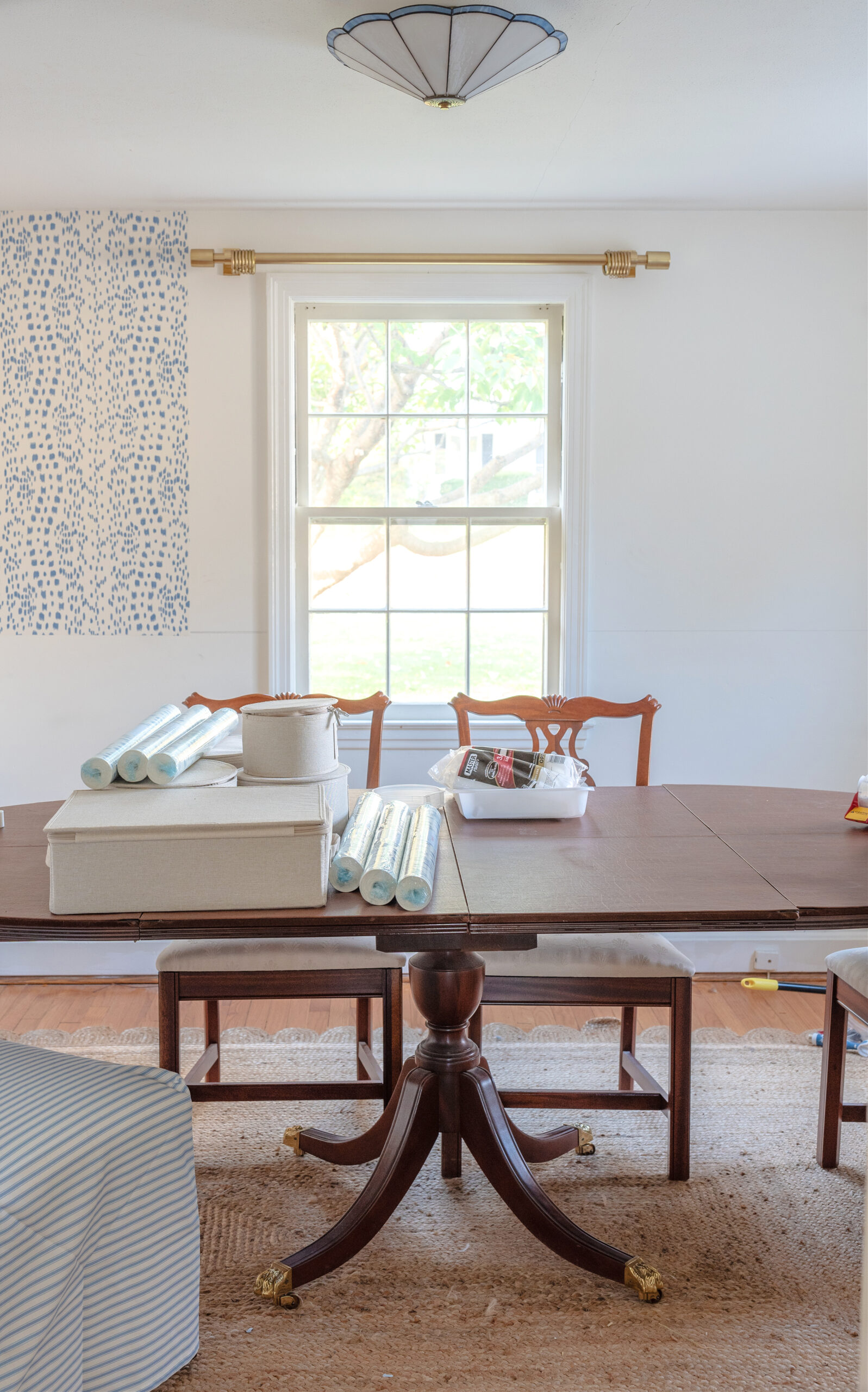
The bottom half of the walls will have chair rail and a picture moulding design. Once all the paper is up, we can install the crown moulding too. I selected a dental crown to match details in our living room.
Chandelier
I decided I’m going with a classic Venetian chandelier and strayed a tad from the equestrian ones. I ordered it this weekend and it should arrive in time for installation this week. I kept going back and forth and when I did a deep dive of inspiration photos over the years, my most beloved dining rooms had classic Murano or crystal chandeliers in them. That helped me decide. Plus, the style is very in line with the period of home.
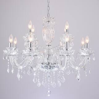

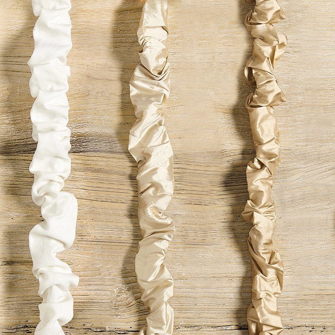
Also, I want this room to usher in each season and I like the idea of switching out the candelabra shades on whim with color and pattern. I ordered classic off-white silk shades to start and maybe for holiday I’ll switch out for red for a pop.
Dining Chairs
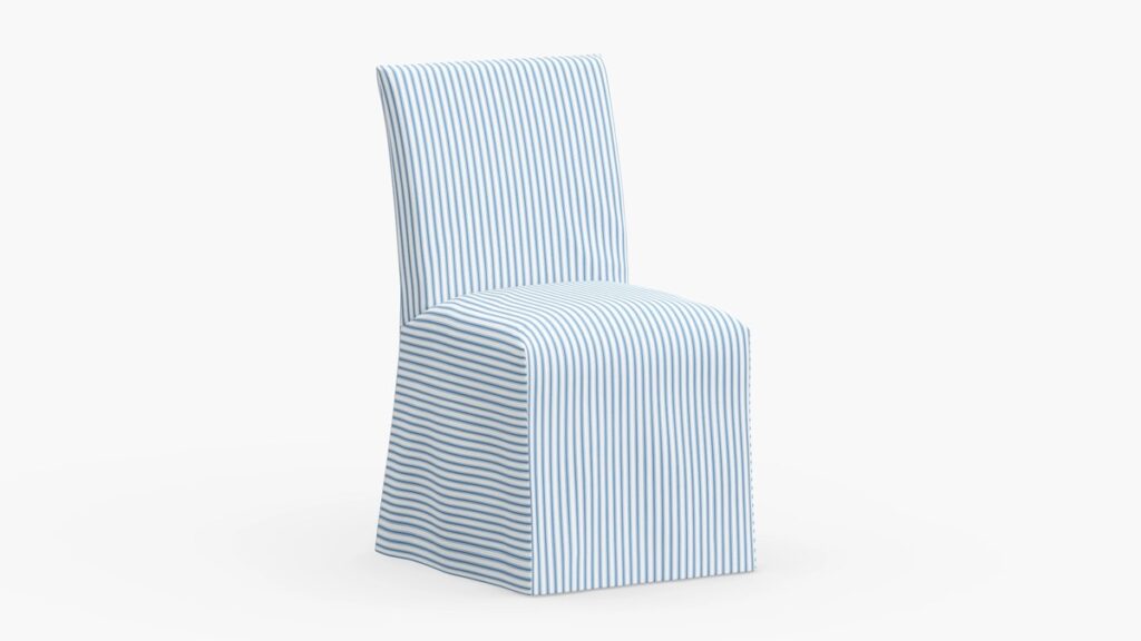
I am partnering with The Inside on our dining chairs. They were a fab partner on our bedroom design last year that you can see HERE. The Inside has a great standard Parsons chair that you can customize with slipcovers in all different fabrics. I love the look of slipcovered dining chairs and it also gives me some future flexibility in pattern and color if I want to change up the slipcovers.

Window Treatments
The window treatments have been ordered and because I want something on the windows for holiday, I ordered from the Ballard Designs sale this weekend. They have some great in stock options and these will carry me through the year. If I want to go custom in the future, these drapes are neutral enough that I can use them in a different space later.
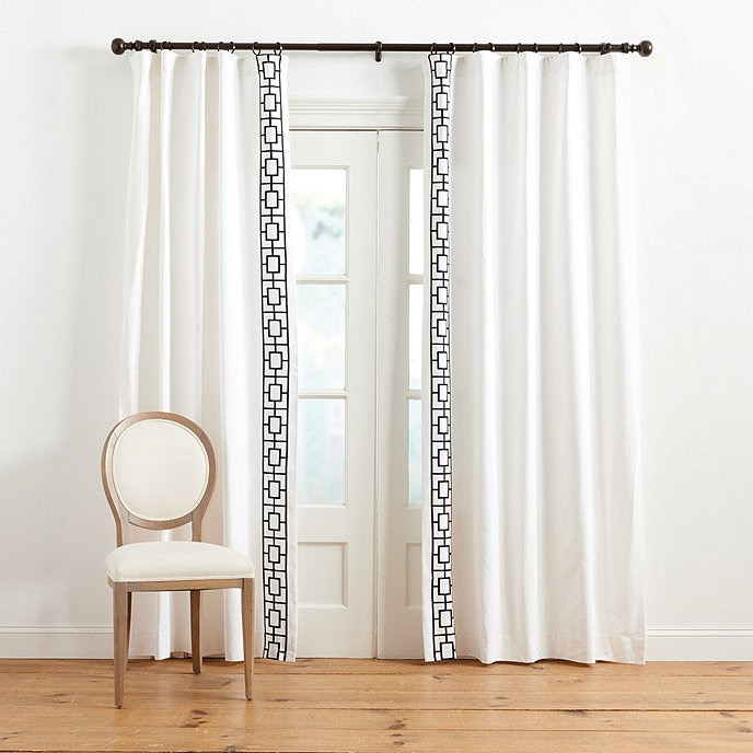

Hanging them with drapery pins and rings will give them a nicer look than a standard rod pocket. A great solution if you are on a time crunch!
Source List



Coming up…
Our goal is to have the bones of this space finished up before Thanksgiving, so the next couple of weeks we’ll be working away! This weekend we are installing all the trim, rail, and picture moulding. I’ll share another dining room update next week and some sourcing and inspiration posts along the way too.
